Strategies That Support Effective and Cohesive Wayfinding
Moving Beyond Signage, Designers Focus on Accessibility at Every Turn
By Megan Headley
Exit Design estimates that 800,000 verbal directions are given each year in the average 1 million-square-foot medical center. And for many visitors, that may still not be enough to help them confidently get where they’re going.
With the increased importance placed on patient satisfaction, effective wayfinding has become even more central to supporting care. While signage is an essential part of wayfinding—that spatial art and science of guiding healthcare visitors to their destination—it’s but one of many tactics that form a part of an effective wayfinding strategy.
“I think the fact that we are now healthcare consumers and no longer patients is really important to what’s happening in wayfinding and egress routing now because it’s all about using the space to better manage ourselves and our day,” points out Cynthia Hubbell, vice president of healthcare and senior living for The Mohawk Group.
Consider the following examples in building a cohesive wayfinding strategy for your next facility or renovation.
Flooring
Creative flooring designs that utilize inlays or distinctive patterns can serve an orienting function, starting from the main entryway.
“Flooring can also be used to create an important wayfinding tool to safely guide patients and visitors through an unfamiliar facility as they seek treatment and visit loved ones,” comments Tasha Hughes, PR marketing specialist for nora systems Inc. “At the same time, the flooring lends itself to the use of inlays that can support a design theme with colorful logos, images, and patterns or provide a way to measure progress for patients who are working on walking skills.”
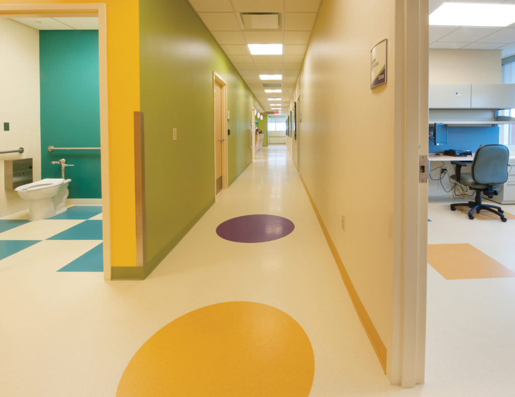
Photo courtesy of nora systems Inc.
“We can use flooring for crowd control and egress routing,” Hubbell adds. “If we look at acute care or [medical office buildings] or senior living, there’s a lot of foot traffic coming in and out of those spaces: You’ve got visitors, staff, residents, deliveries, a lot of people moving about that space. So, when we look at the Lean Six Sigma approach of managing that space safely, it just makes sense to use flooring for direction and to use color cues.”
Hughes points to a 25,000-square-foot tenant space constructed in 2013 to house a new joint children’s clinic for Duke Medicine and WakeMed Health & Hospitals in Raleigh, North Carolina. Administrators selected noraplan® sentica as the flooring for more than 90% of the overall floor area. The choice was driven in part by the bright, cheerful color options available, but the flooring also aids in wayfinding.
“We designed what we were calling the ‘race track’ that organized the scheme around the core elevators and toilet rooms,” explains Pierre Mercier, project architect with Studio Forty. “Within this corridor, we added purple circles that map out a circulation path and allow patients to establish themselves in relation to the exits and lobby.”
Flooring is particularly useful to create wayfinding for individuals who are easily lost. “When we get into senior living, we can use flooring to help those who are afflicted with dementia or have Alzheimer’s and memory issues,” Hubbell says. “You can use the floor to help their brain understand and process that space and help them understand, for example, where the wall ends and the floor begins.”
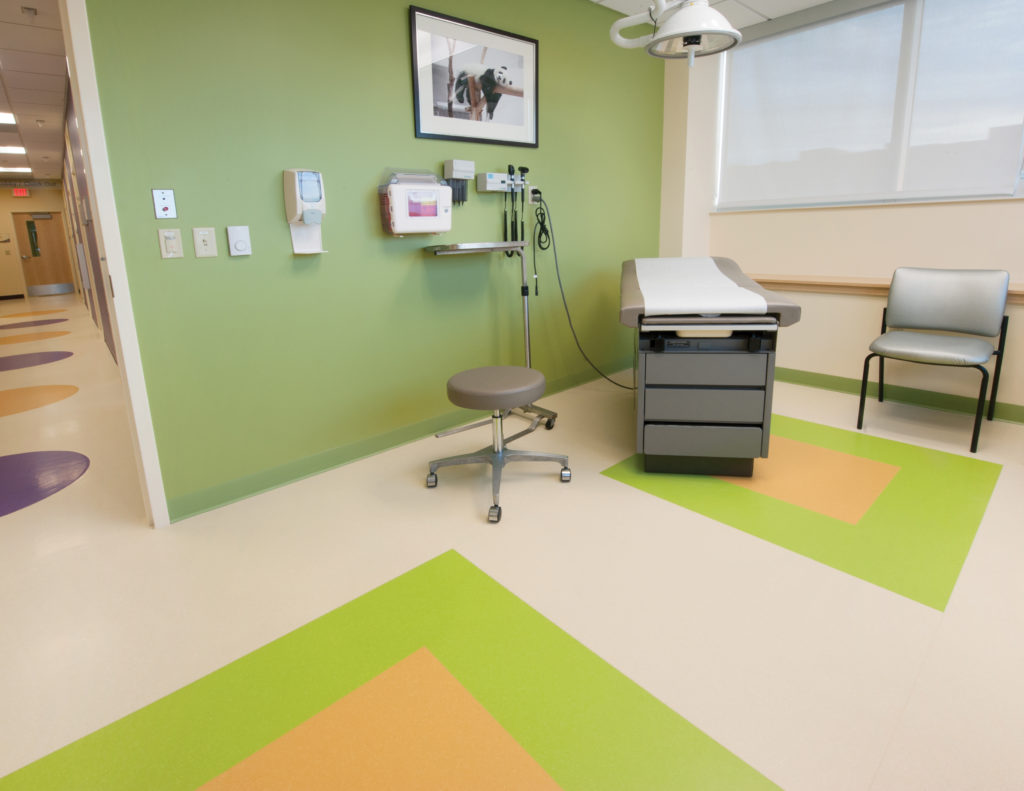
Photo courtesy of nora systems Inc.
Mohawk has created memory care guidelines for flooring that advise on colors and patterns to use (and avoid) in order to create clear wayfinding for senior care centers. “You want to make sure the floor and the wall base are all very different colors so the patient can process that space,” Hubbell says. “Keep in mind that those who have Alzheimer’s, for example, don’t have an understanding much of the time, depending on how severe their affliction is, of their physical body in that space. When we frame the interiors to help that process, it’s a cue to help them understand where they are.”
Colors and themes
Color remains one of the most effective strategies for wayfinding, whether it’s accents applied to the walls or floors, or synchronized palettes used for signage. But many institutions are going a step further and using colorful themes to create landmarks that help visitors easily locate themselves within a specific section of the facility.
For example, Seattle Children’s Hospital uses a four-zone wayfinding system to create an uplifting patient experience while aiding visitor navigation. For the opening of an addition in 2013, the hospital brought in the expertise of wayfinding designer Studio SC. The facility’s design was switched from six zones, each somewhat unrelated in theme, to four zones themed after the Pacific Northwest: Forest, River, Mountain, and Ocean. In addition to helping visitors more easily identify where they’re heading, the artwork used in each of the new zones offers positive distractions and creates an emotional connection to the hospital’s brand.
Photo courtesy of Seattle Children’s Hospital.
Landmarks
Lucile Packard Children’s Hospital, a part of Stanford Children’s Health, followed a similar pattern as Seattle Children’s Hospital with its theme-based wayfinding when it opened its new facility in December 2017.
The new Main Building and existing West Building are themed around California’s eco-regions, a navigation aid that is incorporated in signage and graphics, as well as flooring inlays, materials palettes, and other visual elements throughout the hospital. For example, level one is green in both buildings, but the West Building’s Ocean theme clearly delineates a split from the Main Building and its Forest theme.
Stanford University turned to the experts—ecologists and hospital patients—in selecting animal “ambassadors” for each floor that are welcoming and endemic to that floor’s themed eco-region. For example, the second floor of the Main Building, with its Valley theme, features tiger salamanders and kit foxes. Sculptures of each ambassador can be found along the main entrance and repeated near elevators; the animals are also included in the signage on each floor.
The regional themes are reinforced with additional distinctive works of art. The Rocky Shore, for example, features tide-pool mosaics embedded in its terrazzo floor and 100 aluminum-cast bird sculptures, individually suspended from the ceiling, that lead the way upstairs. In addition, unique sculptures are strategically placed on every floor to serve as navigational markers at the connections between the West and Main buildings.
Lighting
When Saint Barnabas Medical Center, a flagship facility of RWJBarnabas Health, opened its 5-story, 241,000-square-foot addition in September 2017, visitors were greeted with a lighting landmark.
The Livingston, New Jersey medical center worked with The Lighting Practice to create a prominent lighting design that reinforces wayfinding. The design’s most striking example is the dynamic LED feature wall at the entrance that transforms via color-changing panels during holidays and special events. But in addition, throughout the facility, undulating lights flow through public corridors and gathering spaces. These wave-like references provide familiar cues that help navigate corridors and create a sense of arrival at specific areas.
As Michael Barber, principal of The Lighting Practice, notes on a company blog, “We’ve been getting requests to add interior and exterior color-changing lighting effects.” Customizable colors, and the illusion of movement they can provide, offer unique ways to support both corporate branding as well as wayfinding.
Natural lighting is becoming an increasingly important design element as evidence indicates that the connection to the outdoors can speed patient recoveries. But designers are also finding that they can use natural lighting and open views in main circulation areas to help orient facility visitors. For example, the Dale and Frances Hughes Cancer Center, part of Lehigh Valley Hospital – Pocono, frames garden views in the center of its L-shaped building to aid in wayfinding. An engineered mountain stream flows toward the building’s main lobby and provides a clear path of travel as visitors wind their way through the facility. All of the facility’s major waiting areas face the garden, and the same view greets visitors as they exit elevators on the second floor.
About the Author
Megan Headley is a freelance writer and owner of ClearStory Publications. She has covered healthcare safety and operations for numerous publications. Headley can be reached at megan@clearstorypublications.com.